Getting there! I’m quite happy with the way things are turning out, and I think I’m set with the colour scheme. I’m just worried there’s too much type? But I feel it’s also kinda needed. Any feedback would be delightful!
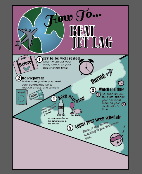
Getting there! I’m quite happy with the way things are turning out, and I think I’m set with the colour scheme. I’m just worried there’s too much type? But I feel it’s also kinda needed. Any feedback would be delightful!

This is looking good! The colours you have used compliment each other well and the numbering system works well and aids the flow. Something you could look out for is the volume of text you have, and the sizing of the smaller text. The smaller text is a little too small, which makes it harder to read.
LikeLike
I love your layout and how different it is to most of the infographics I’m seeing. The linear progression of this layout is used really well and the eye follows it easily especially with the different colours. Something I’ve noticed though is you might want to not break the black border line between sections 1-2 and 3-5 as it it quite obvious due to the back border otherwise looking really good 👍
LikeLike
Pingback: Top 5 Comments | Visual Communication
Looking great! I love the way it is layout. The only thing I could see that might need some improvement is the black line being covered up by the cloud looks a bit inconstant. The text is a also little difficult to read, you could think about increasing the size perhaps? Otherwise cool job!
LikeLike